
Kitchen, living room, bedroom or bathroom: not every space has the same impact on the decision to buy. Discover the hierarchy of interior renders that sell, and where to invest to close more deals.
There is a question every developer should ask before commissioning the renders for a project:
Which spaces have the most influence on the decision to buy?
Not the most beautiful ones. Not the most photogenic. Which ones will move the people who decide the most?
The answer is not obvious, and it is different from what most people assume. There are spaces everyone asks to have rendered, and there are spaces everyone underestimates. And the difference between the two can decide whether a launch has a waiting list or a case of nerves.
This article answers that question with data, with buyer psychology and with years of experience working out what makes someone stop, save and say “this is the one.”
The premise: not every space carries the same weight in the decision to buy
When a buyer views a property, in person or through renders, they do not process every space in the same way.
Some spaces create immediate emotional impact. Others are assessed rationally. And others are simply checked, confirmed as “acceptable”, without creating any positive or negative feeling.
This distinction is essential to understanding where to invest in render quality.
Spending the same visualisation budget on every space is like treating every page of a book the same way, ignoring the fact that the cover, the title and the back cover are what decide whether someone buys it.
In property, some spaces are the cover and some are the middle chapters of the book.
The hierarchy of spaces in the decision to buy
The kitchen: the space that closes the most sales
There is a reason the most experienced estate agents say that “the kitchen sells the house.”
It is not an unfounded popular belief. It is buyer psychology with decades of evidence behind it.
The kitchen is the only space in the home that combines three elements rarely found together in other rooms: function, emotion and aspiration.
It is functional: the buyer immediately assesses whether there is room to cook, whether there is enough storage, whether the layout makes sense for their daily life.
It is emotional: it is where the family gathers, where conversations happen while dinner is being made, where weekend mornings take place.
It is aspirational: a premium kitchen, with fine materials, an island and stools, and carefully designed lighting, represents a standard of living. Whoever sees it in a render is not just assessing a room. They are imagining a better version of themselves.
What a kitchen render needs in order to sell:
The angle has to place the viewer inside the space, not looking in from outside. A camera at a height of 1.20m to 1.40m, slightly below eye level, creates a perspective that heightens the sense of scale and immersion.
Styling is decisive. A kitchen rendered empty is a technical demonstration. A kitchen with a Chemex coffee maker on the island, cookery books on the shelf, fruit in a marble bowl and a plant in the corner: that is a home.
The light should be warm and natural, ideally in the morning or late afternoon, with soft shadows that reveal the texture of the materials. Midday light is too harsh and night-time light too artificial.
Materials have to be rendered with tactile detail: the veining of the marble island, the grain of the wooden cabinets, the reflection on the metal handles. These details are not decoration; they are the value argument that supports the price.
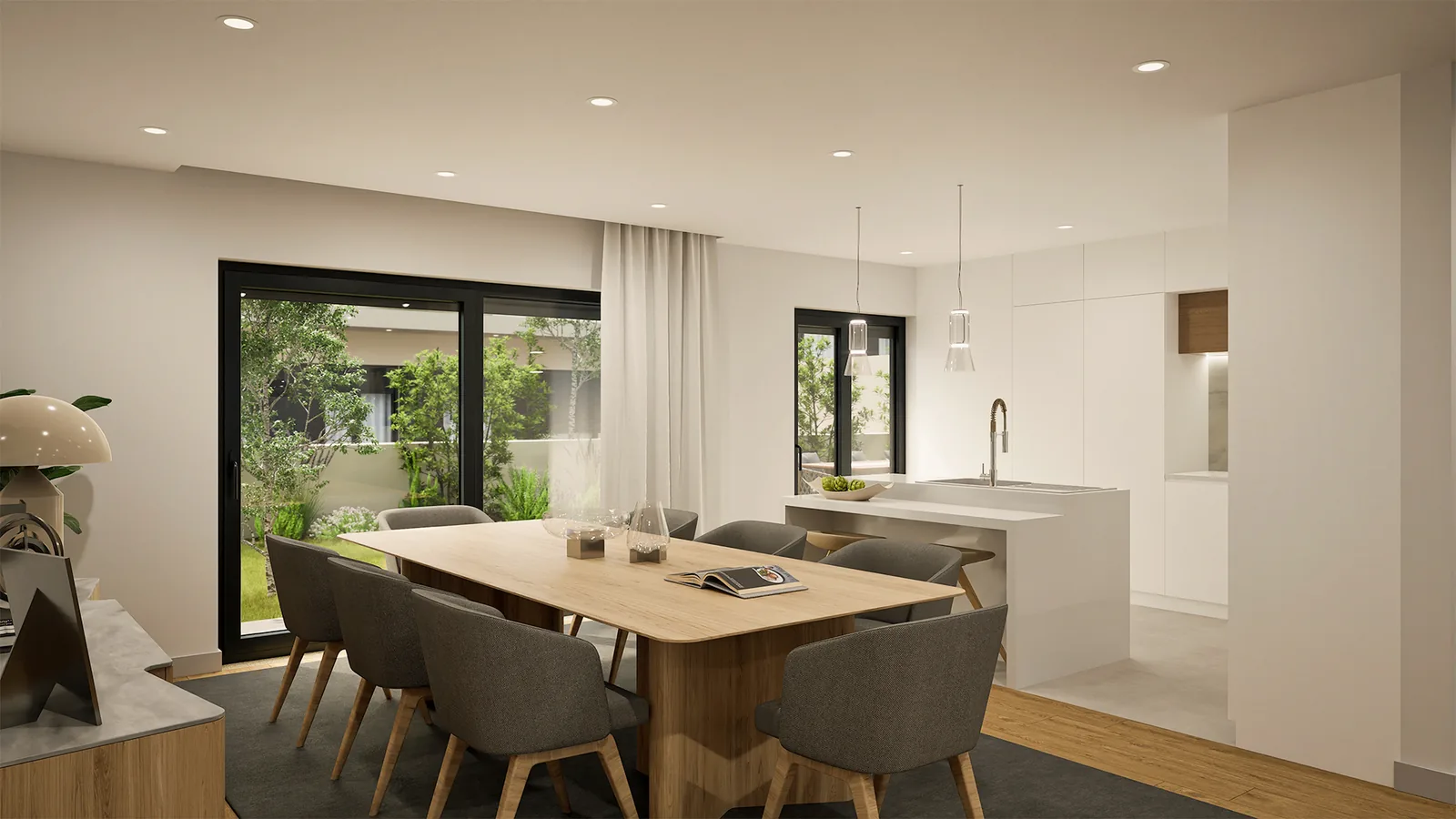
The living room: the space that creates desire
If the kitchen closes sales, the living room opens them.
It is the first space most buyers picture when they think about the home. It is where they imagine entertaining friends, where they see the family together, where they imagine unwinding after a day at work.
The living room has a specific role in property marketing: creating the “I want to live here” moment.
This is the space that gets the most saves on social media. The one most often sent on with the message “look at this.” The one that creates the first emotional spark, which the other spaces then need to sustain.
What a living room render needs to create that moment:
Scale has to be communicated intelligently. A small living room rendered from the wrong angle looks even smaller. A large living room rendered from too wide an angle loses its intimacy. The right angle is the one that strikes the best balance between scale and cosiness.
Natural light is the most powerful element. Sunbeams coming through the windows, shadows cast on the floor, the quality of the light at different times of day: all of this brings life to a space that does not yet physically exist.
Styling should tell a story without explaining it. A sofa with books stacked beside it, a coffee table with a candle and a glass of water, a throw folded over the arm of the sofa: each element says something about who lives there, without the need for words.
The relationship with the outside is often underestimated. If the living room opens onto a balcony, terrace or garden, that relationship has to be visible in the render. The outside is part of the product. Hiding it is leaving value on the table.
The main bedroom: the space that validates the decision
The main bedroom rarely closes a sale on its own. But it seals many decisions that were already almost made.
It is the space of validation. The buyer who has already been moved by the kitchen and the living room reaches the bedroom with a concrete question: “Can I picture myself waking up here every day?”
If the answer is yes, the decision moves forward. If the answer is hesitant, a doubt arises that is hard to resolve without a physical visit.
The main bedroom render therefore has a different role from the others: it does not need to impress. It needs to convince.
What a bedroom render needs in order to convince:
The proportions have to be honest. A bedroom that looks spacious in the render but in reality barely fits a double bed and two bedside tables is a render that creates disappointment. And disappointment does not close sales; it cancels them.
Morning light is the most powerful in this space. Soft light coming through a window, long shadows on the floor, the feeling of a new day: this kind of lighting creates a positive emotional association that is very hard to replicate with artificial light.
Textile detail matters more here than in any other space. The texture of the cushions, the fold of the bed linen, the rug at the foot of the bed: these elements communicate comfort in a way no building material can.
The intimacy of the space must be preserved. A bedroom rendered from too wide an angle loses its essence. The bedroom is a private space, and the render should convey that privacy.
The main bathroom: the most underestimated space
The bathroom is the space most often underinvested in when it comes to 3D visualisation, and it has one of the biggest impacts on how a project's quality and luxury are perceived.
Why? Because in small spaces, materials are everything.
In a 20m² bedroom, a mediocre choice of flooring gets lost in the space. In an 8m² bathroom, the same choice completely dominates the visual experience.
That means a well-rendered bathroom, with natural stone, careful lighting, mirrors that enlarge the space and premium fittings, can raise the perceived value of the whole project out of all proportion to its size.
What a bathroom render needs:
Lighting is critical. A bathroom with cold, uniform light looks like a hospital. A bathroom with warm lighting, indirect light on the stone surfaces and an illuminated mirror: that looks like a spa.
The detail of the materials is the central argument. Stone should be rendered with visible veining and texture. Taps and fittings should have a realistic metallic finish. The mirror should reflect the space convincingly.
The balance between scale and detail needs careful handling. In small spaces, wide-angle renders distort and create unreal perspectives. The right angle is moderate: honest about the size, generous about the quality.
Outdoor spaces: the argument that settles the price bracket
Balcony, terrace, garden, pool: these spaces play a very specific role in the decision to buy: they justify the price.
An apartment with a terrace rendered in a mediocre way looks merely “more expensive because it has a terrace.” An apartment with a terrace rendered at sunset, with quality outdoor furniture, the city visible in the background and a glass of wine on the table: that looks like “the home I have always wanted.”
The difference between the two is not the terrace. It is the render.
What an outdoor render needs:
The time of day is the decision with the most impact. Golden hour, the 30 to 60 minutes before sunset, is the magic hour of exterior visualisation. The light is warm, the shadows are long and the space looks inviting in a way no other time of day can replicate.
The surrounding context is mandatory. A balcony with no city, no greenery and no real sky is a balcony that does not sell. The context, whether a skyline, a garden, the sea or simply a tree-lined street, is part of the product.
Lifestyle styling matters even more than indoors. A laid table, two chairs, a bottle, glasses, a plant: the complete scene that answers the unspoken question, “what would I do here?”
The right order for your render portfolio
Based on the impact of each space on the decision to buy, this is the hierarchy of investment in 3D visualisation for a residential project:
Top priority: Kitchen with open-plan living room (the space that closes the most sales), exterior at golden hour (the price-bracket argument), and main suite with bathroom (the validation space).
High priority: Living room with a visible relationship to the outside, a quality main bathroom, and details of premium materials and finishes.
Complementary priority: Secondary bedrooms, relevant circulation areas (entrance, or corridor if there is something to highlight), and communal areas in multi-unit developments.
The golden rule: the first three renders a buyer sees determine 80% of their emotional decision. The rest either confirms or questions it. So the first three have to be the strongest, and they have to be chosen with intent, not by convention.
What online behaviour reveals about the interior renders that sell
Engagement patterns on social media consistently confirm this hierarchy:
Kitchen renders have the highest share rates, especially when they feature an island, lifestyle styling and warm light. They are the ones that most often prompt a “look at this.”
Living room renders have the highest save rates, especially those that show the relationship with the outside. People keep them as a reference for how they want their home to be.
Renders of outdoor spaces at sunset have the highest comment rates, especially for projects with a view or a quality urban setting. They start the conversation the algorithm amplifies.
Renders of premium bathrooms serve a different purpose: they do not generate immediate engagement, but they build the perception of quality that supports the price of the whole project.
Conclusion
Not every space is worth the same.
The kitchen closes sales. The living room creates desire. The bedroom validates the decision. The bathroom raises the perception of quality. The outdoor space justifies the price.
Each space has a role. Each render has a function. And when that function is clear before production begins, the result is a series of images that work together as a sales strategy, not as a catalogue of spaces.
The difference is not in the number of renders. It is in the intelligence with which they are chosen, produced and used.
👉 Preparing a project and want to define the right render strategy for each space? Talk to us.
Foreseen Projects (formerly Hugo Guerra Design) is a studio specialising in architectural and real estate 3D visualisation, a strategic partner to architects, developers, builders and interior designers in Portugal.